M/A self initiated - mapping amsterdam
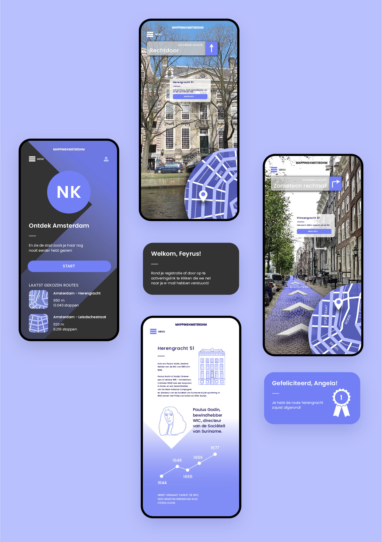
objective I wanted to create an app, an interactive tour-guide that guides you through Amsterdam and display historical events. Working title: Mapping Amsterdam.
The idea is that you can choose different routes, while infographics and animations pop up through Augmented Reality.
2022
leadtime - 8 months
ui design
ux design
branding
animation
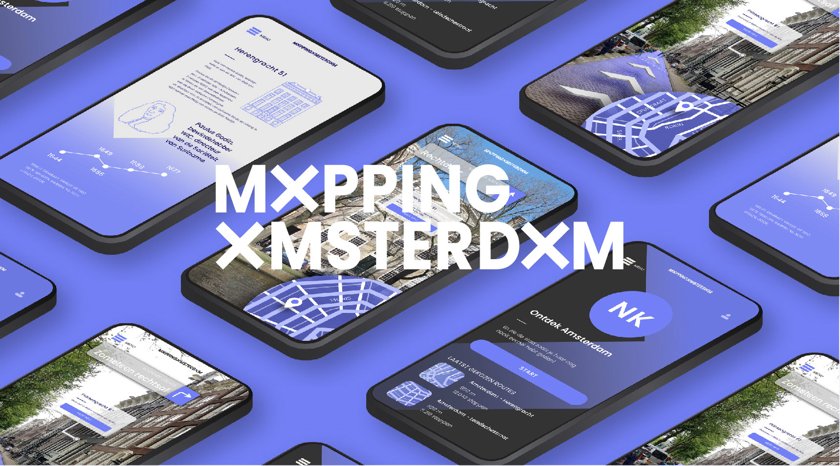
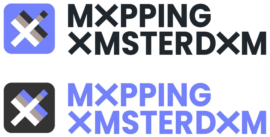
the logo is derived from the three x-es that make up the amsterdam symbol. the x-es are placed on top of eachother, because the app uses augmented reality. in that sense, what you see on your mobile screen is layered just as the logo.
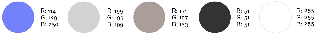
the colors amsterdam uses in its visual communication is black, white and red. however, i associate this with agression, with soccer and overall i do not love those colors for ui-design. i therefor chose an opposing color, that communicates a calmer sense. the blue accent color is supported by different shades of neutrals.
conclusion In this project I combine different skills; from the building of the brand and its identity-assets, to illustration and animation. The aim is to finish the project somewhere mid 2022.